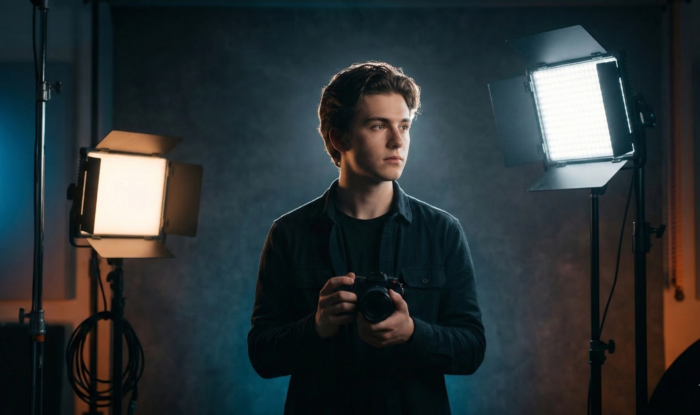
Close your eyes for a moment and picture the promotional poster for a modern summer blockbuster. Whether it is a high-octane Michael Bay explosion-fest, a gritty Marvel superhero epic, or a post-apocalyptic chase through a desert, a specific visual pattern likely emerges in your mind’s eye. You see a hero with glowing, sun-kissed skin standing against a backdrop of deep, shadows and cool, electric night.
This isn’t a coincidence. It is the Teal and Orange phenomenon—a visual language so pervasive that it has become the “standard” for cinematic excellence over the last two decades. But why? Is it merely a lack of imagination among Hollywood’s elite, or is there something deeper at play?
To the untrained eye, color is just decoration. To the master cinematographer, color is a weapon. It is a tool used to manipulate the human psyche, guide the viewer’s attention, and create a sense of three-dimensional depth on a flat, two-dimensional screen. In this comprehensive guide, we will shatter the myths surrounding Hollywood’s favorite palette and unlock the sacred workflow behind Mastering Color Theory: Why Orange and Blue Dominate Hollywood.
Key Takeaways
- Biological Imperative: Human skin tones naturally occupy the orange/red quadrant of the color spectrum, making blue its natural biological contrast.
- The Power of Contrast: Complementary colors (180 degrees apart) create the highest level of visual tension and “pop.”
- Technical Evolution: The shift from photochemical film to the Digital Intermediate (DI) in the early 2000s allowed colorists to isolate and push these hues with unprecedented precision.
- Depth Perception: Warm colors appear to advance while cool colors recede, creating a simulated 3D effect.
- Professional Execution: Success lies in “Skin Tone Protection”—keeping the humans looking natural while pushing the environment into the teal.
Table of Contents
- The Science of the Spectrum: Why Our Brains Crave Contrast
- The Historical Evolution: From Technicolor to Digital
- The Psychology of Fire and Ice
- Technical Execution: Achieving the Look (On-Set vs. Post)
- Case Studies: The Masters of the Palette
- Beyond the Trope: When to Break the Rules
- Expert/Insider Tips: On-Set & Post-Production
- Conclusion: The Future of Color in Cinema
- FAQ: People Also Ask
II. The Science of the Spectrum: Why Our Brains Crave Contrast
At the heart of every great cinematic frame lies a fundamental understanding of physics and biology. To understand why Hollywood color grading trends lean so heavily on orange and blue, we must first look at the color wheel for filmmakers.
H3: The Complementary Color Rule
In color theory, complementary colors are those located directly opposite each other on the color wheel. When placed side-by-side, these colors create the highest possible contrast. The human eye is biologically designed to notice contrast; it is a survival mechanism that helps us distinguish a predator from the foliage.
Orange and blue are the ultimate “power couple” of the color wheel. Because they sit 180 degrees apart, they offer a visual vibration that feels vibrant and “alive.” This is why a sunset over a deep blue ocean looks more “spectacular” than a sunset over a brown field—the color relationship creates a visceral power that demands attention.
H3: The “Skin Tone” Factor
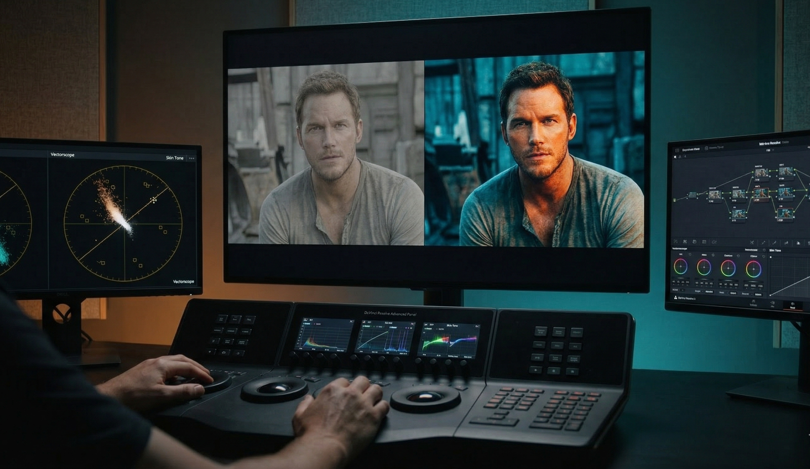
If you look at a Vectorscope—the tool professional colorists use to measure hue and saturation—you will notice a “skin tone line.” Regardless of an actor’s ethnicity, human skin contains blood and melanin, which consistently fall into the orange/red quadrant of the color spectrum.
To make an actor “pop” off the screen, you need to surround them with a color that doesn’t compete for the same space. If the background is also warm (yellows/reds), the actor blends into the scenery, resulting in a “muddy” or flat image. By pushing the shadows, mid-tones, and backgrounds toward Teal, the colorist creates a stark separation. The skin becomes the focal point because it is the only “warm” element in a “cool” world.
H3: Depth and Dimension: Color Perspective
Cinematography is the art of making a 2D plane look like a 3D world. We use lighting, lens choice, and movement to achieve this, but color is an equally potent tool.
In the world of optics, long-wavelength colors (reds, oranges, yellows) are perceived by the brain as “advancing” or moving toward the viewer. Short-wavelength colors (blues, purples, teals) appear to “recede” or move away. By using an orange-blue palette, filmmakers create a literal sense of depth. The characters (orange) move toward us, while the world they inhabit (blue) falls back into the distance. This creates a “wrapped” 3D feeling that draws the audience into the narrative.
III. The Historical Evolution: From Technicolor to Digital
The dominance of the teal and orange look isn’t just a stylistic whim; it’s a byproduct of technological liberation.
H2: The Birth of the Digital Intermediate (DI)
For decades, color was baked into the film stock or manipulated through chemical “timing” in a lab. This was an arduous process with limited flexibility. Everything changed in the year 2000 with the Coen Brothers’ film, O Brother, Where Art Thou?.
This was the first feature film to use a full Digital Intermediate (DI). The entire film was scanned into a computer, allowing cinematographer Roger Deakins to manipulate specific colors without affecting the rest of the frame. He chose a sepia, “dusty” look, but the floodgates were opened. Suddenly, colorists could isolate “Skin Tone” and “Background” independently.
H2: The Michael Bay Era
By the mid-2000s, the “Teal and Orange” look became the industry standard for high-octane action. Directors like Michael Bay and Zack Snyder pushed the saturation to its limits. In films like Transformers, the orange explosions against the deep teal night skies became a visual shorthand for “Big Budget.” It was the era of “Cinematic Color Grading” as a marketing tool. If a movie looked teal and orange, the audience subconsciously associated it with a high-production-value blockbuster.
IV. The Psychology of Fire and Ice
Beyond the physics and the tech, there is the psychology of color. Humans have primal, deep-seated associations with orange and blue.
H2: Universal Dichotomies
- Orange: Represents fire, the sun, warmth, humanity, and hope. It is the color of the “hearth”—the place where humans find safety.
- Blue/Teal: Represents the ocean, the night, coldness, technology, and the “unknown.” It often symbolizes isolation or the overwhelming scale of the world.
When a filmmaker pits these two against each other, they are visually representing the struggle of Man vs. Environment.
H3: Emotional Resonance
Think about the difference between The Matrix and Skyfall.
- In The Matrix, the colorists used a heavy green tint to represent the artificiality of the digital world. It feels sickly and “wrong.”
- In Skyfall, cinematographer Roger Deakins utilized a Blue and Gold palette (a sophisticated cousin of teal and orange) to create a sense of classic elegance and high-stakes drama.
Changing the “flavor” of your blue or the “warmth” of your orange completely alters the genre feel. A “neon-noir” uses pinks and teals to feel futuristic and seedy, whereas a “western” uses browns and deep blues to feel rugged and earthy.
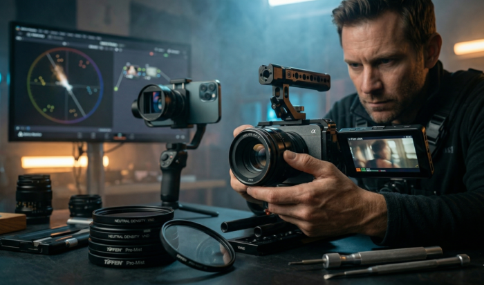
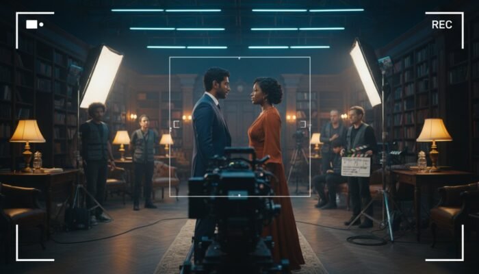
V. Technical Execution: Achieving the Look (On-Set vs. Post)
The biggest mistake aspiring filmmakers make is thinking that “Teal and Orange” is just a filter or a LUT (Look Up Table) applied in post-production. Real cinematic depth starts on the set.
H2: On-Set: It Starts with Production Design
“Fixing it in post” is the mantra of the amateur. To achieve a professional look, you must utilize Production Design and Lighting:
- Complementary Wardrobe: If your actor has warm skin, dress them in cool colors (navy, teal, dark grey) to create instant separation.
- Color Temperature Mixing: Use CTB (Color Temperature Blue) gels on your background lights or “rim” lights, while keeping your key light on the actor’s face at a warm 3200K (Tungsten).
- The Blue Hour: Shooting during “Blue Hour” (the time just after sunset) provides a natural teal canvas. Adding a warm light source (a campfire or a practical tungsten lamp) creates the look organically.
H2: In the Grade: The DaVinci Resolve Workflow
DaVinci Resolve is the industry standard for color grading. Here is the sacred workflow for achieving a sophisticated teal and orange look:
- Step 1: Balancing and Neutralizing: Before you “look,” you must “correct.” Ensure your whites are white and your blacks are black.
- Step 2: The “Skin Tone Mask”: Use an HSL Qualifier to select only the skin tones. Invert that selection so you are only affecting the background/shadows.
- Step 3: Split Toning: Push your “Shadows” and “Mid-tones” toward Teal. Then, go back to your skin tone node and ensure they remain on the skin tone line of the Vectorscope.
- Step 4: Skin Tone Protection: This is the secret. Professional colorists never let the teal bleed into the skin. Use “Parallel Nodes” to ensure the skin remains vibrant and healthy while the rest of the world turns cold.
VI. Case Studies: The Masters of the Palette
To truly master cinematic color palettes, we must look at the work of those who do it best.
H2: The High-Octane Approach: Mad Max: Fury Road
Cinematographer John Seale and director George Miller took the trope to its extreme. The desert is a vibrant, saturated orange, and the night scenes (shot day-for-night) are a deep, electric teal. It isn’t subtle, but it is incredibly effective at conveying the “visceral power” of a world pushed to its environmental limits.
H2: The Moody Noir: Blade Runner 2049
Roger Deakins (again) uses teal to signify a cold, dystopian future. However, he uses orange sparingly—usually through fire or artificial light—to signify the few remaining “human” or “soulful” elements in a robotic world. This is a masterclass in Skin Tone Protection in Grading.
H2: The Subtle Version: The Revenant
In The Revenant, the palette is restricted to naturalistic cold blues and the warm glow of firelight. It feels raw and “un-graded,” but in reality, it is a highly calculated use of color theory to emphasize the harshness of the wilderness vs. the fragility of human life.
VII. Beyond the Trope: When to Break the Rules
Every trend has a saturation point. Some critics argue we are in the “Dark Age” of color, where every movie looks identical. As a filmmaker, knowing when not to use teal and orange is just as important as knowing how to use it.
H2: Modern Alternatives
- Analogous Palettes: Using colors that are next to each other on the wheel (e.g., Greens and Blues). This creates a harmonious, calm, or eerie feeling (think The Shape of Water).
- Monochromatic Styles: Sticking to variations of a single color. This is incredibly bold and creates a “graphic novel” feel.
- The “Neon-Noir” Trend: Swapping orange for Magenta or Pink. This is seen in films like Drive or John Wick, providing a modern, synthetic energy.
H3: Subverting Expectations: Wes Anderson
Wes Anderson is the king of breaking Hollywood norms. He often uses Triadic color schemes (three colors equally spaced on the wheel) or pastel analogous palettes. By avoiding the teal/orange trap, his films feel like “whimsical storybooks” rather than “gritty realities.”
VIII. Expert/Insider Tips: On-Set & Post-Production
For those ready to move beyond “YouTube tutorials” and into professional execution, here are four tips from the front lines of the industry:
- The 70/30 Rule: Do not split your frame 50/50 between orange and blue. It looks cheap and artificial. Instead, let one color dominate 70% of the frame (usually the teal/cool tone) and use the other 30% (the skin or a practical light) as a “pop.” This creates a more “expensive” and intentional look.
- Watch Your Mid-tones: Newbie colorists often “wash” the whole image in teal. Professionals keep the mid-tones clean. If the mid-tones are neutral, the contrast between the shadows (blue) and the highlights (orange) feels more realistic.
- Motivate Your Colors: If you have a blue light hitting the side of an actor’s face, there must be a reason. Is it the moon? A neon sign? A computer screen? Unmotivated color feels like a “Instagram filter” and breaks the audience’s immersion.
- The Scopes Don’t Lie: Your eyes will fatigue after 20 minutes of grading. You will start to think a green tint looks normal. Always keep your Vectorscope and Parade open. If your skin tones are drifting off that skin tone line, stop and recalibrate.
IX. Conclusion: The Future of Color in Cinema
The teal and orange palette persists because it is rooted in the very way humans perceive the world. It provides the highest contrast, the greatest depth, and the most pleasing representation of the human form. However, a “look” is not a substitute for a story.
As you develop your unique voice as a filmmaker, use these principles as a foundation—not a cage. Experiment with the “visceral power” of different palettes, but always return to the “Why.” Why this color for this scene? Why this contrast for this character?
Mastering the look of Hollywood isn’t about clicking a LUT; it’s about understanding the ‘Why’ behind every pixel. If you’re ready to stop guessing and start grading like a pro, join our Cinematic Color Grading Masterclass at Cinemastery Academy. Learn the exact workflows used by industry veterans to create world-class visuals and forge your own cinematic vision.
Start your journey at Cinemastery Academy
X. FAQ: People Also Ask
Q: Why do movie posters use orange and blue?
A: Maximum contrast. When a poster is competing with dozens of others in a theater lobby or on a streaming app, the orange/blue pairing catches the eye faster than any other combination due to its biological impact.
Q: Is the teal and orange look dead?
A: No, it has simply evolved. Modern films use a more “naturalistic” and subtle version of the look, moving away from the heavy saturation of the 2000s toward “Cyan and Gold” or “Soft Teal and Peach.”
Q: What is the best software for color grading?
A: DaVinci Resolve is the industry standard used for over 90% of Hollywood feature films. Other options include Adobe Premiere Pro (Lumetri Color) and Final Cut Pro, but they lack the advanced node-based workflow of Resolve.
Q: Does every skin tone work with orange/blue?
A: Yes. The “orange” on the vectorscope represents the hue of human blood and melanin beneath the skin. While the shade (lightness or darkness) changes between ethnicities, the hue remains remarkably consistent on the skin tone line.
Q: How do I avoid the “cheap” teal and orange look?
A: Avoid globally tinting the entire image. The “cheap” look happens when the whites and the blacks are both tinted. Keep your deep blacks neutral (true black) and your brightest highlights clean. Contrast is only effective if there is a neutral point to compare it to.